Norwegian Fjord Explorer v2
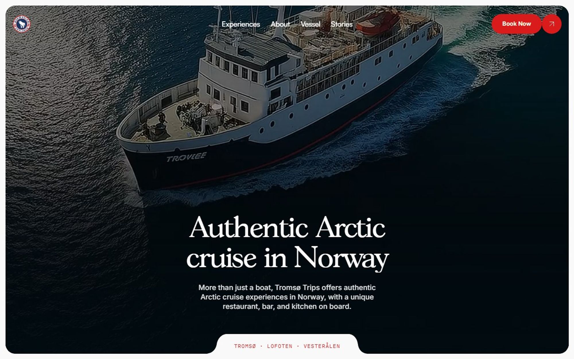
Version 2 of the website for Norwegian Fjord Explorer, authentic Arctic cruises from Tromsø to Lofoten and Vesterålen. This time, the focus was getting visitors from dreaming to booking.
- Client
- Norwegian Fjord Explorer v2
- Industry
- Travel and tourism
- Services
- Web design, Web development
- Tools
- Astro, Lenis, Vercel
- Year
- 2026
The site route
- 01Experiences
- 02Stay aboard
- 03About
- 04Vessel
- 05Stories
- 06Book now
Where it started
The operator’s original site at norwegianfjordexplorer.com stacks seven menu links, six social icons and a scrolling banner about bank transfers above its headline. Version 1 was our first rework. Version 2 goes further: clearer experience categories, a section for staying aboard and stories that build the mood before the booking button.
Original site: norwegianfjordexplorer.com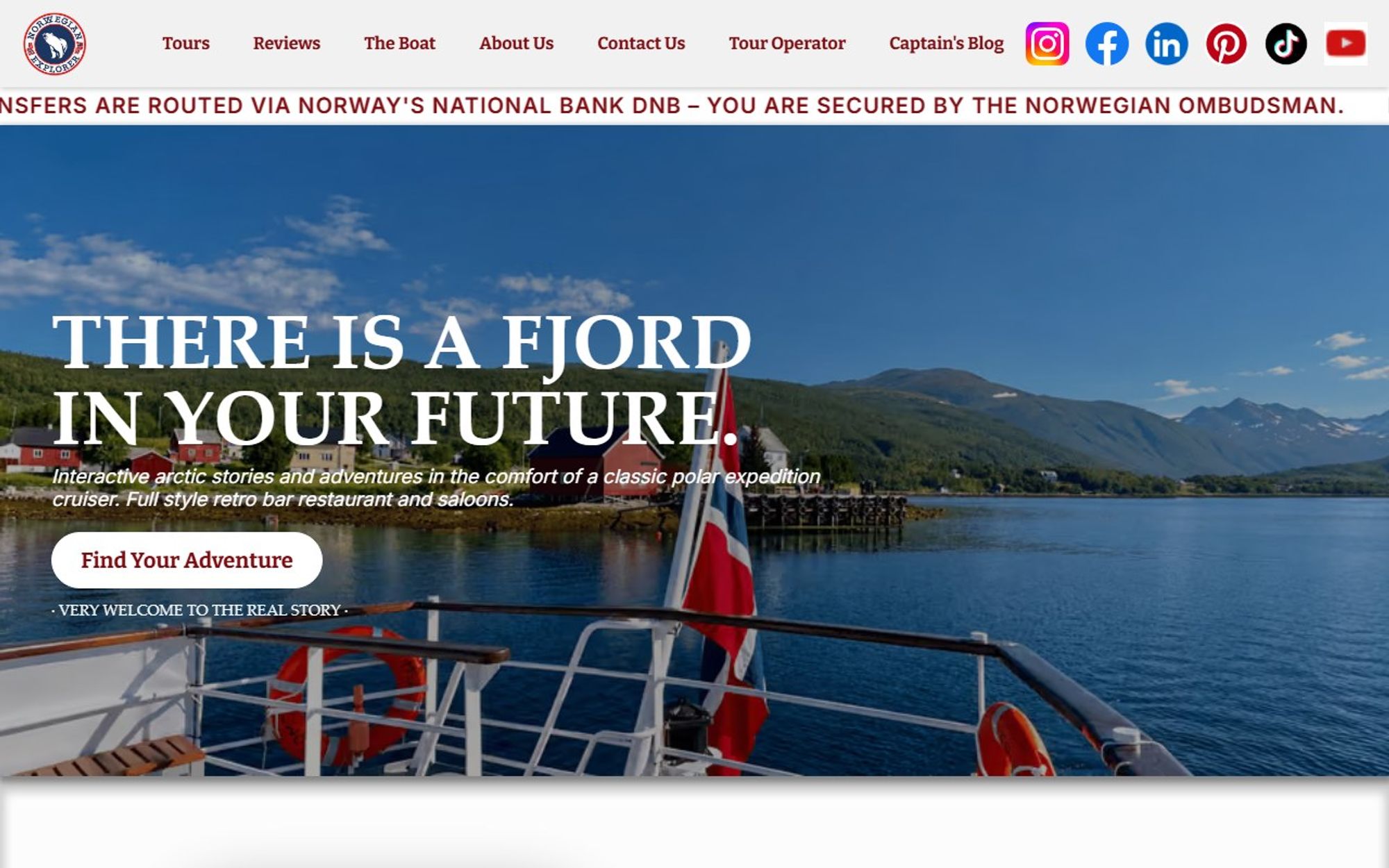
The brief
The cruise offers day trips, stays aboard and private charters. Visitors had to understand those choices at a glance, picture themselves on the fjord and book without second-guessing.
Our approach
Version 2 kept the order we set in version 1 and put booking at the centre. “Book now” opens a booking panel straight away, with “Plan your cruise” beside it. Captain Mads welcomes visitors aboard, and stories build the atmosphere before anyone is asked to commit.
What we did
We kept the structure that worked in version 1 and sharpened everything around it: clearer experience categories, a dedicated section for staying aboard, and stories and vessel pages that build the atmosphere before anyone is asked to book.
What it does
The features that do the work for visitors and for the business.
Booking panel
“Book now” opens a booking panel without leaving the page.
Plan your cruise
Separate paths to plan a cruise or a route.
Welcome from the captain
Captain Mads welcomes visitors aboard from the start.
Stories
“Every fjord has a story”: atmosphere before the booking button.
Tap to call
Two phone numbers that dial straight from a phone.
Email that works anywhere
A standard booking email link that opens in any mail app.
What changed
Area by area, what the original site did and what the redesign does instead.
- First impression
- BeforeSeven menu links, six social icons and a scrolling banner about bank transfers, above an all-caps headline.
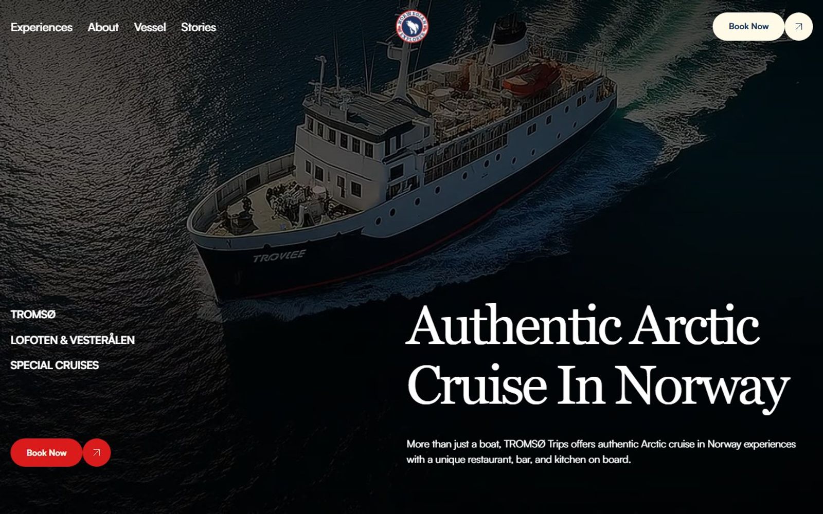
- AfterFour menu links, a plain headline, “Authentic Arctic cruise in Norway”, and “Your Arctic journey starts here.”
- Booking
- BeforeThe booking email link opens Gmail’s web composer, which only works for visitors signed in to Gmail.
- After“Book now” opens a booking panel, alongside “Plan your cruise” and “Plan your route”.
- Contact
- BeforeNo phone numbers to tap on the homepage.
- AfterTwo tap-to-call numbers and a standard email link that works in any mail app.
- Search results
- BeforeNo meta description, so search engines pick their own snippet.
- AfterA written description naming Captain Mads, Tromsø, Lofoten and Vesterålen.
- Performance2878
- Accessibility88100
- SEO9292
- Best practices79100
| Measure | Before | After |
|---|---|---|
| Page weight | 34.2 MB | 6.0 MB |
| Files loaded | 184 | 28 |
| Main content visible | 6.3 s | 3.1 s |
| Page blocked by scripts | 4,170 ms | 530 ms |
Google Lighthouse, mobile, home page of the original site and of the redesign, measured 8 November 2026. Scores are out of 100 and vary a little between runs.
The result
A focused, immersive site that walks visitors from choosing an experience to booking it, with the feel of the Arctic front and centre the whole way.
Start a project
Tell us what you need and when you need it live. We reply with honest advice and a fixed price, and if we are not the right fit, we will say so.
Book a discovery call
A free 30 minute video call. Talk it through before you commit to anything.
Pick a time