Norwegian Fjord Explorer v1
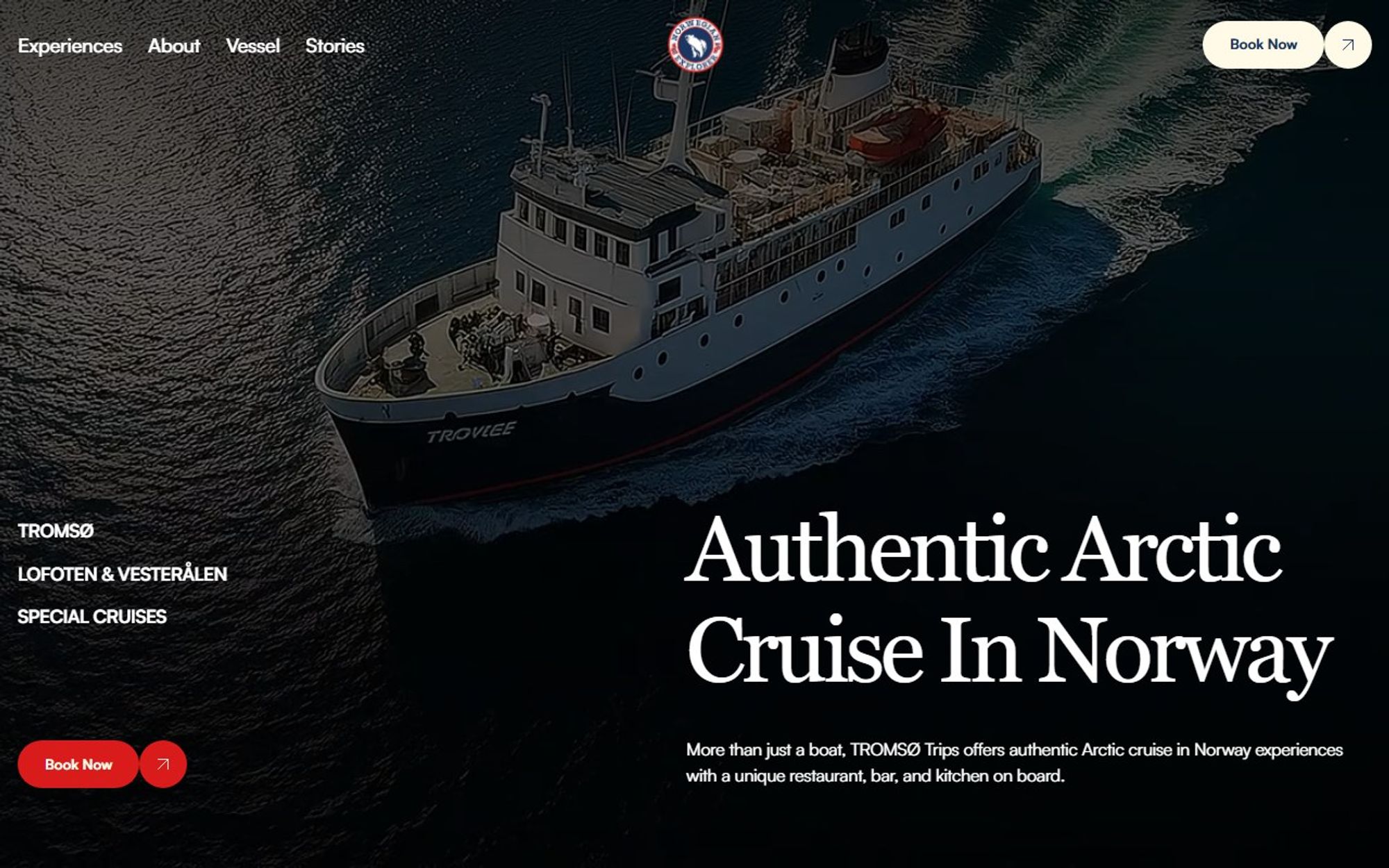
The first website we built for Norwegian Fjord Explorer, Arctic cruises in Norway. The goal: show visitors this is far more than a boat trip.
- Client
- Norwegian Fjord Explorer v1
- Industry
- Travel and tourism
- Services
- Web design, Web development
- Tools
- Astro, Lenis, Vercel
The site route
- 01Experiences
- 02Cruises
- 03About
- 04Vessel
- 05Stories
- 06Book now
Where it started
The original site at norwegianfjordexplorer.com puts a lot at the top of the page: seven menu links, six social icons and a scrolling banner about bank transfers, above an all-caps headline. Version 1 calmed it down and rebuilt the site around the experiences, with booking always one click away.
Original site: norwegianfjordexplorer.com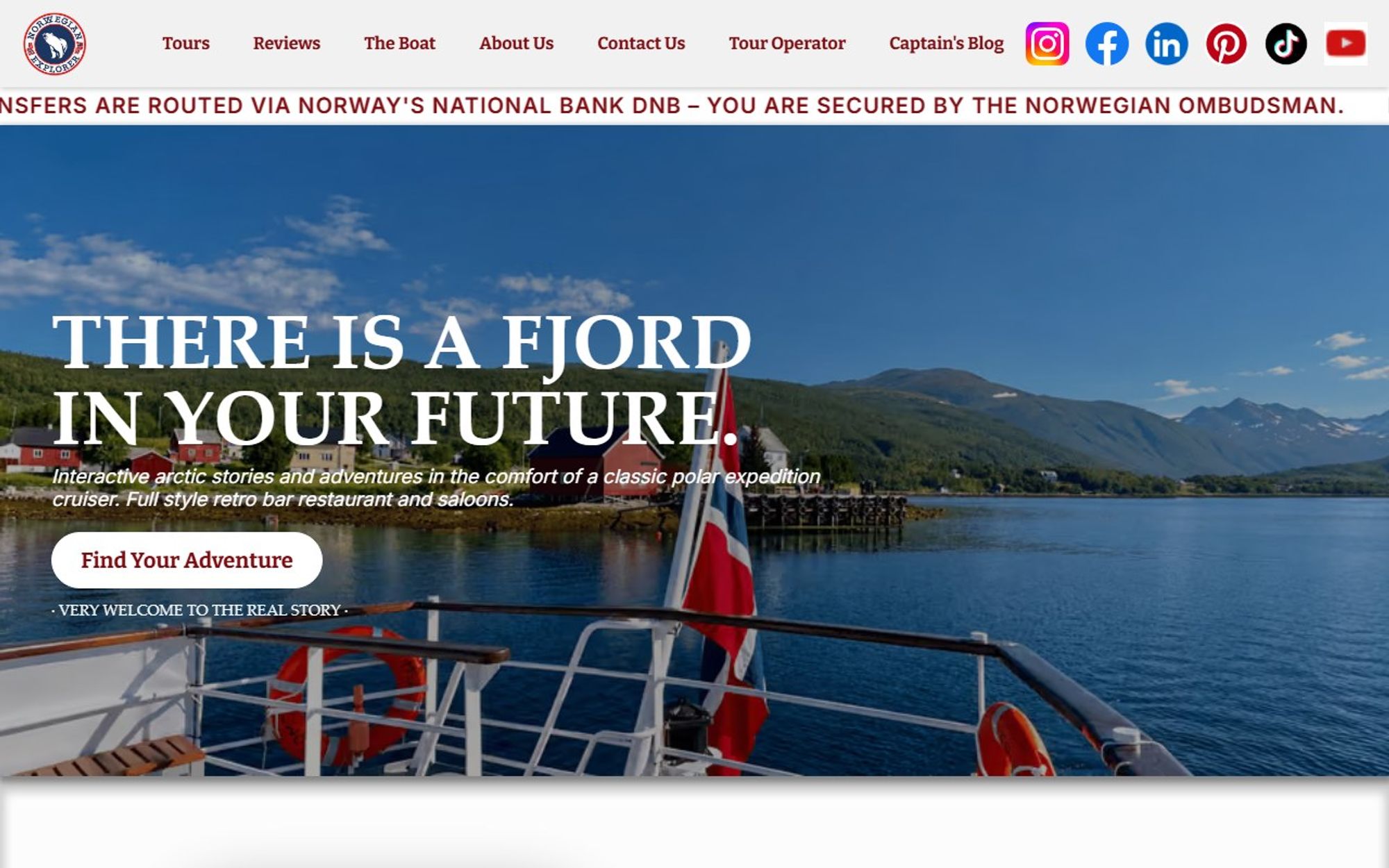
The brief
The operator runs cruises around Tromsø, Lofoten and Vesterålen, plus special cruises and charters. The site had to sell the experience, not just the trip, and make booking simple.
Our approach
The operator had great material: tours, a captain with a story, a documentary series and a classic boat. The problem was that it all spoke at once. We gave it an order, experiences first, then the vessel, the crew and the stories, and built it as a fast static site in Astro.
What we did
We designed and built the site around the experiences themselves: navigation by Tromsø, Lofoten and Vesterålen, special cruises and charters, large Arctic imagery and a “Book now” action always in reach.
What it does
The features that do the work for visitors and for the business.
Choose your experience
The cruises come first, so visitors can pick the trip that suits them.
The vessel
The boat, its deck plan and life aboard, shown before anyone books.
Captain and crew
Captain Mads as host, with journeys and stories from the crew.
Their own documentary
The boat and crew’s TV series, as proof of a real story at sea.
Charters
Options for private and group charters.
Contact form
“Or maybe just contact us?” at the end of the page.
What changed
Area by area, what the original site did and what the redesign does instead.
- First impression
- BeforeSeven menu links, six social icons and a scrolling banner about bank transfers, above an all-caps headline.
- AfterFour menu links and a plain headline that says what it is: “Authentic Arctic cruise in Norway”.
- Choosing a trip
- BeforeTours mixed in with reviews, the captain’s blog and the TV series.
- After“Choose your experience” comes first, followed by the boat, a deck plan and charter options.
- Getting in touch
- BeforeThe booking email link opens Gmail’s web composer, which only works for visitors signed in to Gmail.
- AfterA contact form at the end of the page: “Or maybe just contact us?”
- Search results
- BeforeNo meta description, so search engines pick their own snippet.
- AfterA written description of the cruises for search results.
- Performance2878
- Accessibility88100
- SEO92100
- Best practices7979
| Measure | Before | After |
|---|---|---|
| Page weight | 34.2 MB | 4.0 MB |
| Files loaded | 184 | 19 |
| Main content visible | 6.3 s | 3.4 s |
| Page blocked by scripts | 4,170 ms | 450 ms |
Google Lighthouse, mobile, home page of the original site and of the redesign, measured 8 November 2026. Scores are out of 100 and vary a little between runs.
The result
A strong first version that set the visual direction for the brand, which version 2 then sharpened into a booking-first site.
Start a project
Tell us what you need and when you need it live. We reply with honest advice and a fixed price, and if we are not the right fit, we will say so.
Book a discovery call
A free 30 minute video call. Talk it through before you commit to anything.
Pick a time