Iceberg Quest
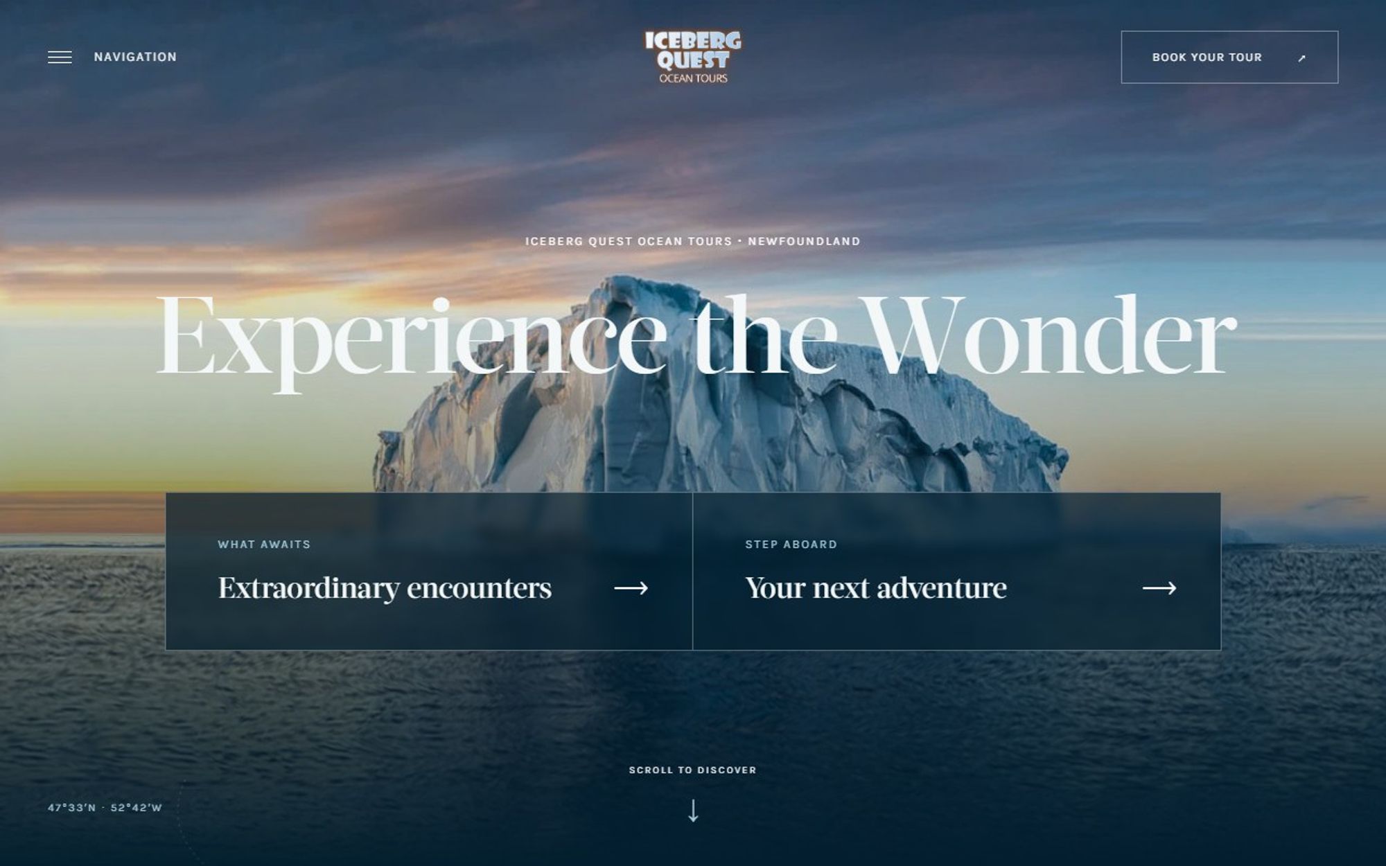
A website for Iceberg Quest Ocean Tours that puts visitors on the deck before they book: icebergs, whales, seabirds and Newfoundland’s coastline.
- Client
- Iceberg Quest
- Industry
- Ocean tours
- Services
- Web design, Astro development
- Tools
- Astro, Lenis, Vercel
The site route
- 01Icebergs
- 02Whales
- 03Seabirds
- 04Coastline
- 05Departures
- 06Before you board
- 07Get in touch
Where it started
Iceberg Quest’s original WordPress site at icebergquest.com sits in a boxed layout under an orange sky banner, with the story told in small italic text and orange tiles for icebergs and whales. We kept the sense of wonder, let the photography and the four encounters lead, and added a clear path to choose a departure point and book.
Original site: icebergquest.com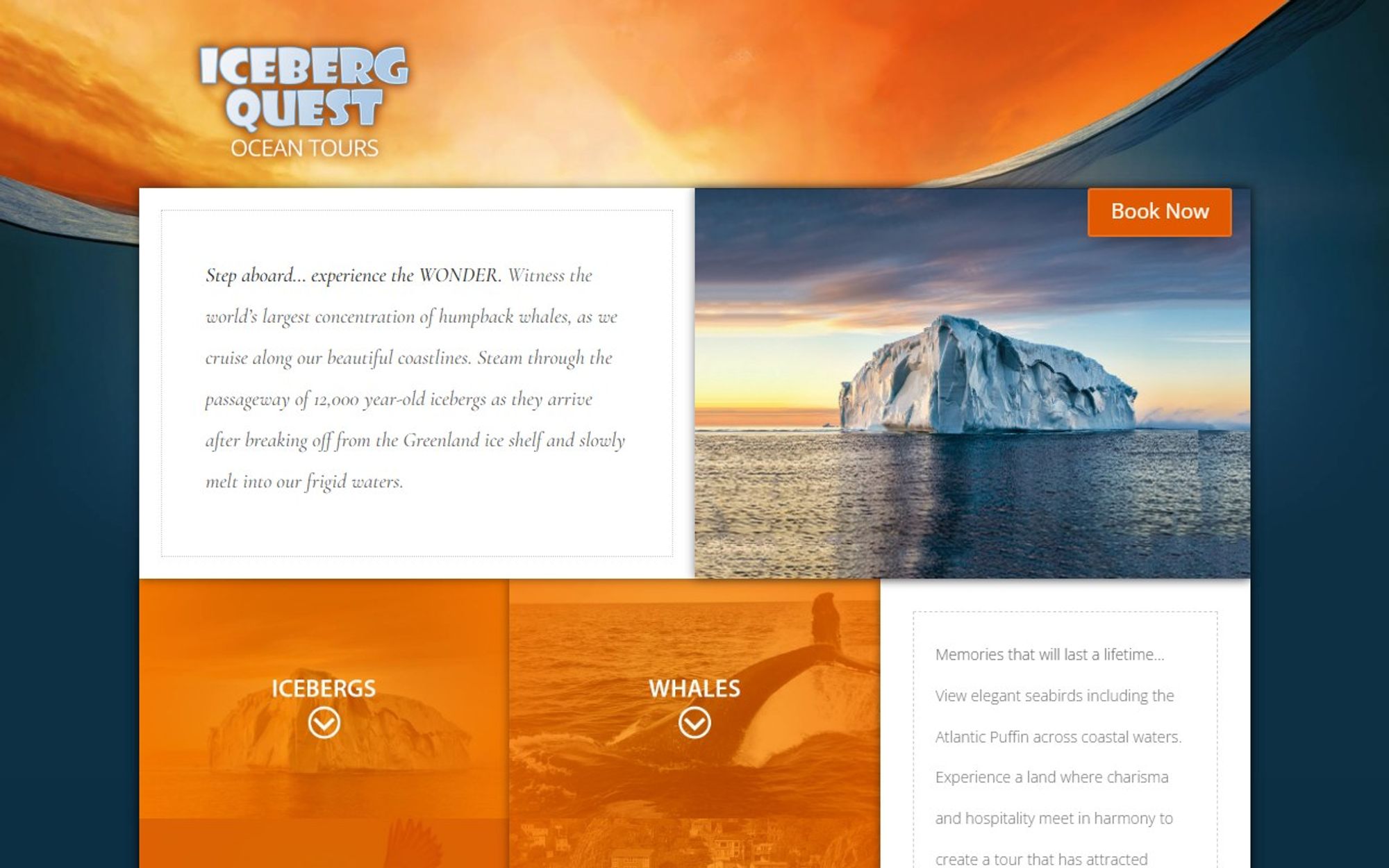
The brief
Iceberg Quest runs narrated ocean tours from St. John’s and Twillingate. Visitors had to feel the wonder of the trip, know what they might see, pick the right departure and know what to expect before boarding.
Our approach
People come to Iceberg Quest for four things: icebergs, whales, seabirds and the coastline. We built the homepage around those encounters, then answered the practical questions in order: which departure point, what to know before boarding and how to get in touch. We kept the existing online booking system, so nothing changed for the team behind the scenes.
What we did
We designed and built the site in Astro around four encounters, icebergs, whales, seabirds and the coastline, followed by a clear choice of departure point, a “before you board” guide and an easy way to get in touch.
What it does
The features that do the work for visitors and for the business.
Four encounters
Icebergs, whales, seabirds and the coastline, each with its own section.
Pick your departure
Separate booking for St. John’s and Twillingate.
Before you board
What to bring and what to expect.
Common questions
“All your questions, answered” in one place.
Tap to call
A phone number for each location and an email link.
Same booking system
Links to the existing online booking, so the team’s process is unchanged.
What changed
Area by area, what the original site did and what the redesign does instead.
- Page structure
- BeforeNo headings on the homepage at all, so search engines and screen readers get no outline.
- AfterOne main heading, “Experience the wonder”, and a section for each encounter.
- Choosing a tour
- BeforeThe two departure points sit inside the menu.
- After“Where will your journey begin?”, with a booking button for St. John’s and one for Twillingate.
- Calls to action
- BeforeTwo “Book now” buttons.
- AfterClear next steps for every stage: discover each encounter, find your tour, book, and read the answers to common questions.
- Contact
- BeforeNo phone number to tap on the homepage.
- AfterTap-to-call numbers for both locations and an email link.
- Performance5486
- Accessibility7588
- SEO85100
- Best practices8293
| Measure | Before | After |
|---|---|---|
| Page weight | 1.5 MB | 864 KB |
| Files loaded | 112 | 16 |
| Main content visible | 11.0 s | 1.4 s |
| Page blocked by scripts | 280 ms | 270 ms |
Google Lighthouse, mobile, home page of the original site and of the redesign, measured 8 November 2026. Scores are out of 100 and vary a little between runs.
The result
A fast, immersive site that sells the experience first, then makes the practical decisions, where to leave from and what to bring, simple.
Start a project
Tell us what you need and when you need it live. We reply with honest advice and a fixed price, and if we are not the right fit, we will say so.
Book a discovery call
A free 30 minute video call. Talk it through before you commit to anything.
Pick a time